New signup flow
Providing users seamless access to Graduateland
Overview
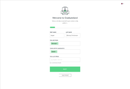
As Lead Product Designer at Graduateland, I redesigned the signup flow to address a critically high drop-off rate. The goal was to simplify the process and help more users successfully create an account. This improved access to the platform’s core job-search functionality. The work focused on identifying friction in the existing flow and iteratively refining the experience through research, testing, and stakeholder collaboration.
My roleOwned UX and UI design for the signup process end-to-end.PlatformWeb platform · Mobile app (React Native)FocusRecruitment · Onboarding · Interaction design · Usability testing · Remote testing · UX researchOutcomeIncreased signup completion rate by 30% by simplifying the flow and validating improvements through user testing.Year2019
The problem
We identified a high drop-off rate in the signup flow, which limited how many users could access the platform’s core functionality. This was a critical issue, as the value of the product depended on users successfully creating an account.
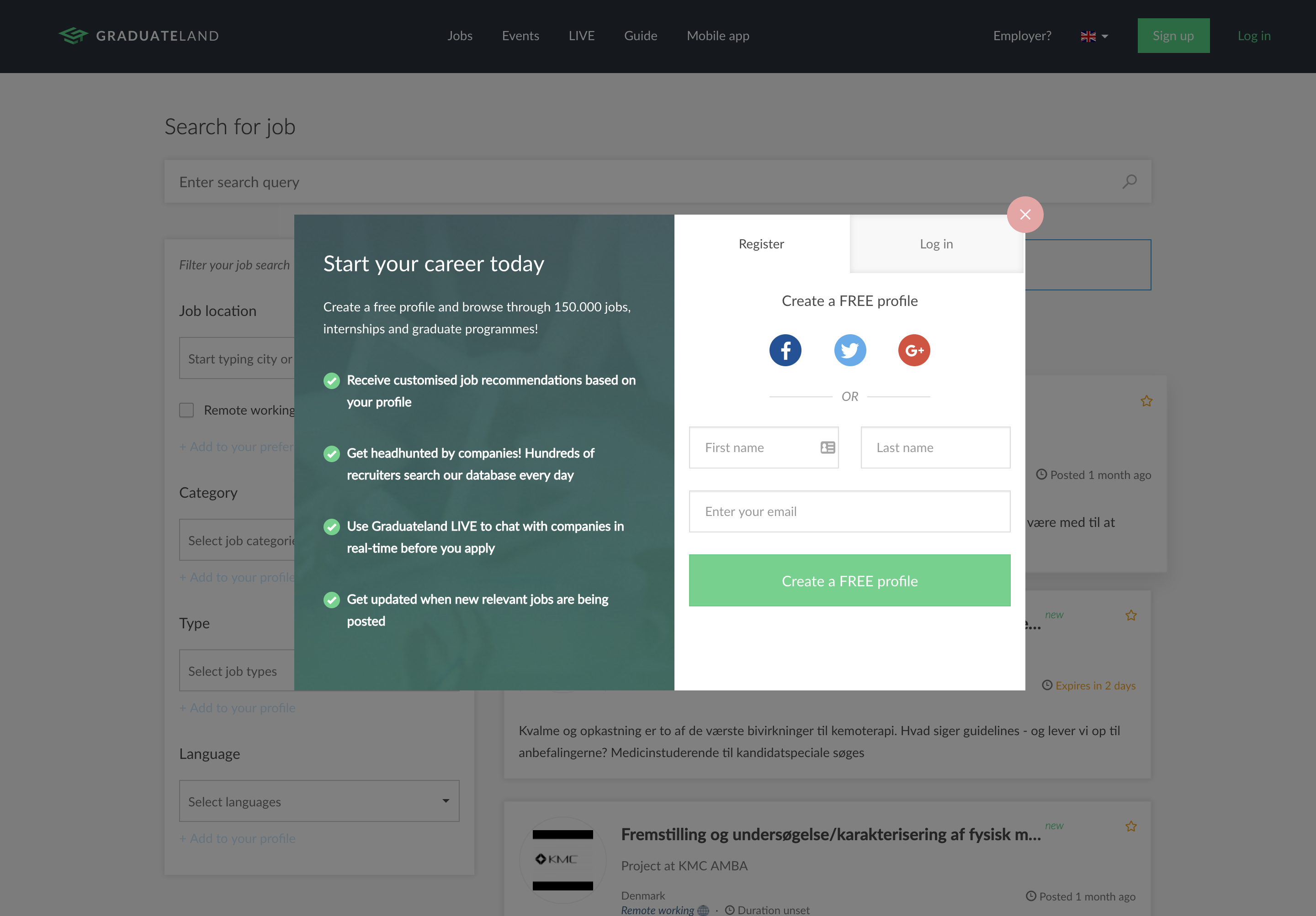
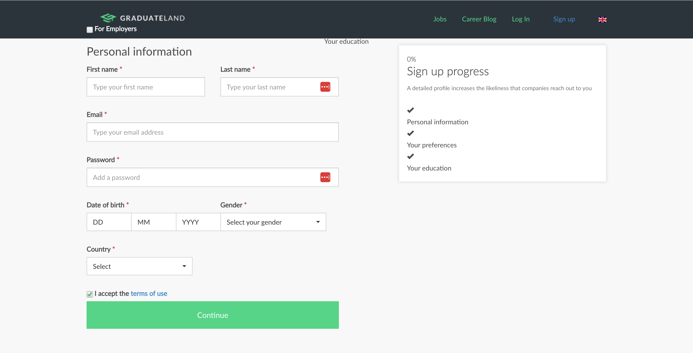
Further analysis revealed several sources of friction. The flow was not fully adapted to mobile use, required users to enter too much information too early, and lacked clear guidance throughout the process. Some of the requested information was not necessary for creating an account and could instead be collected later.
As a result, many users abandoned the flow before completing signup. The goal was to simplify the experience and remove unnecessary barriers so more users could successfully finish the process.
Discovery
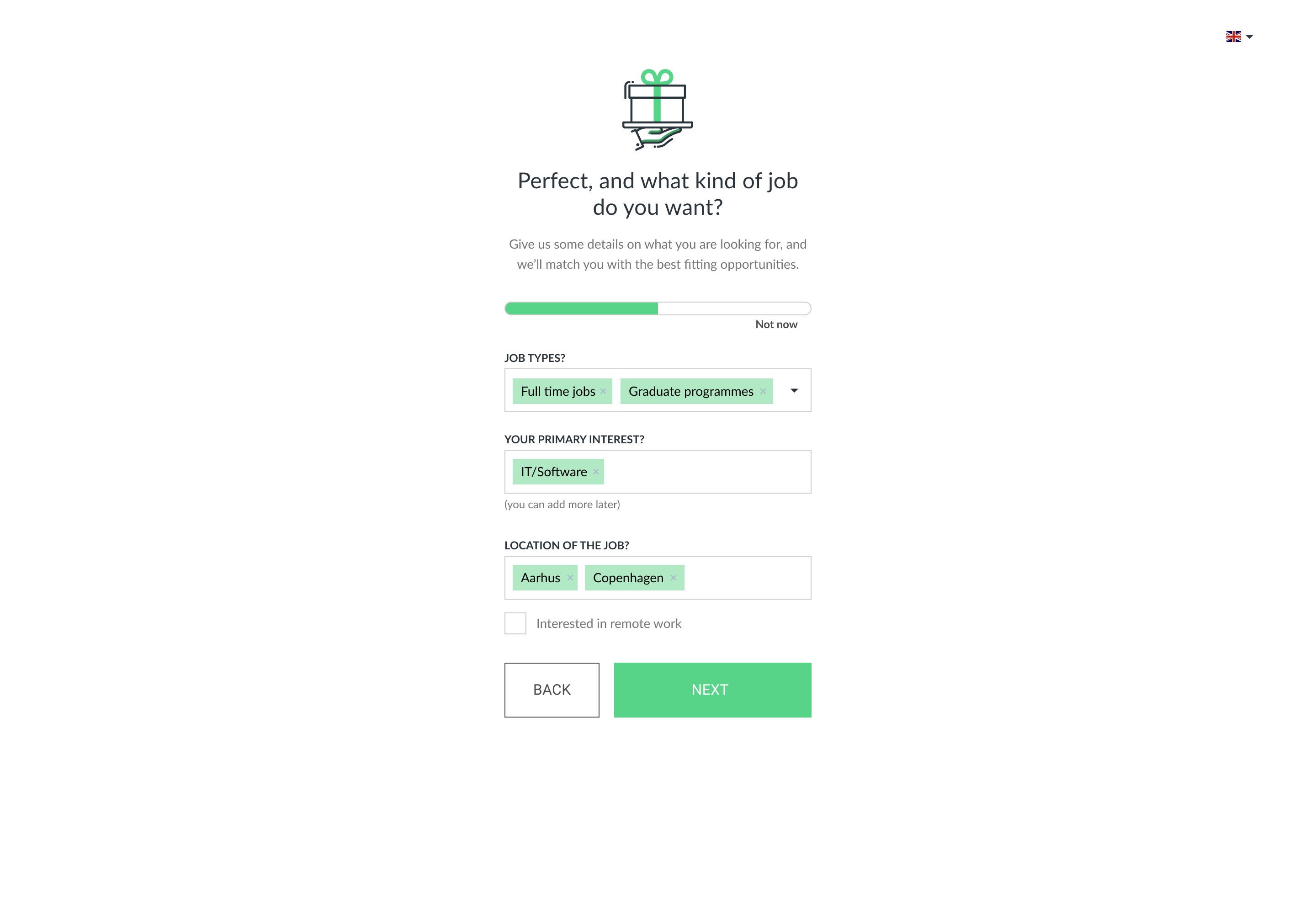
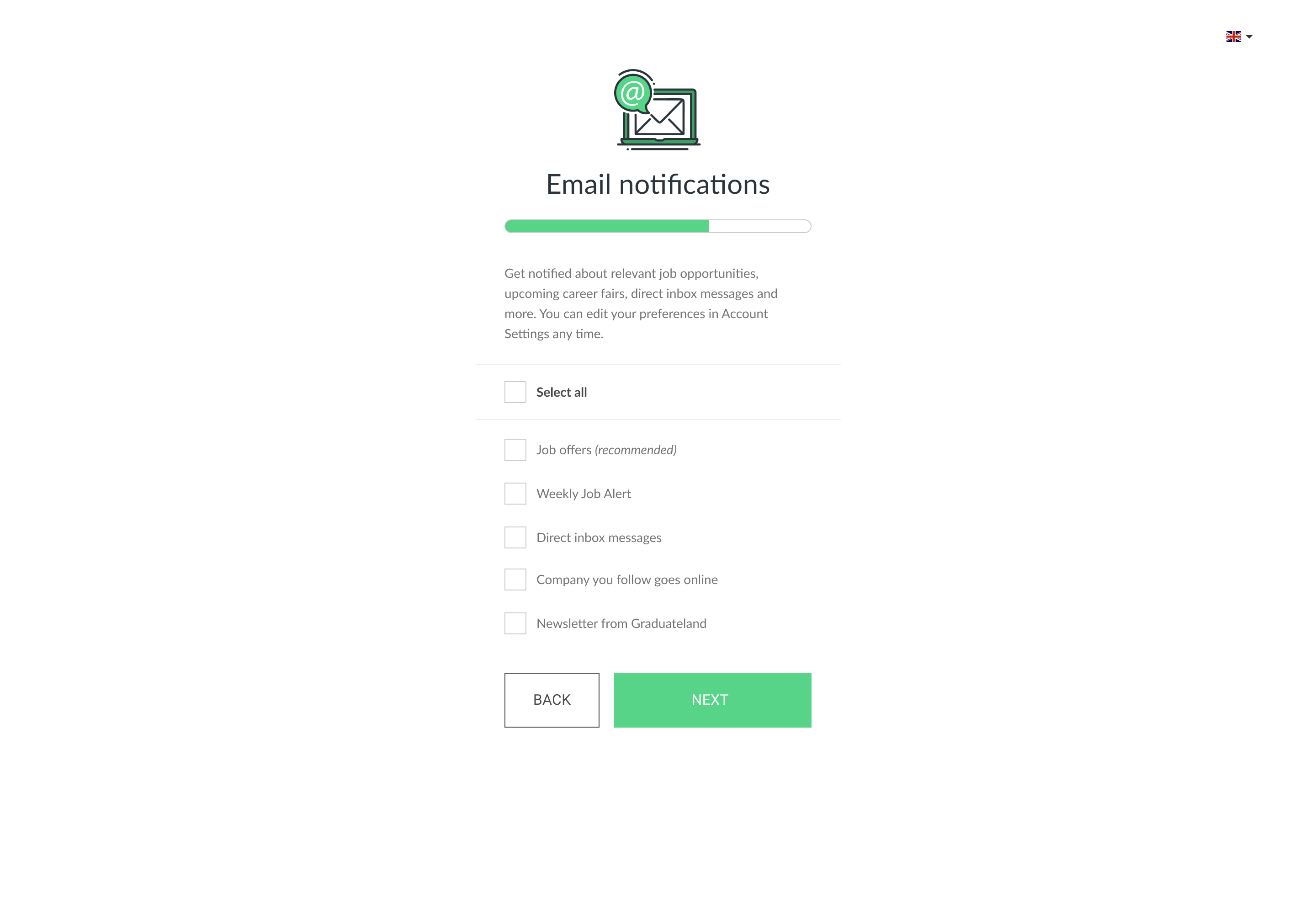
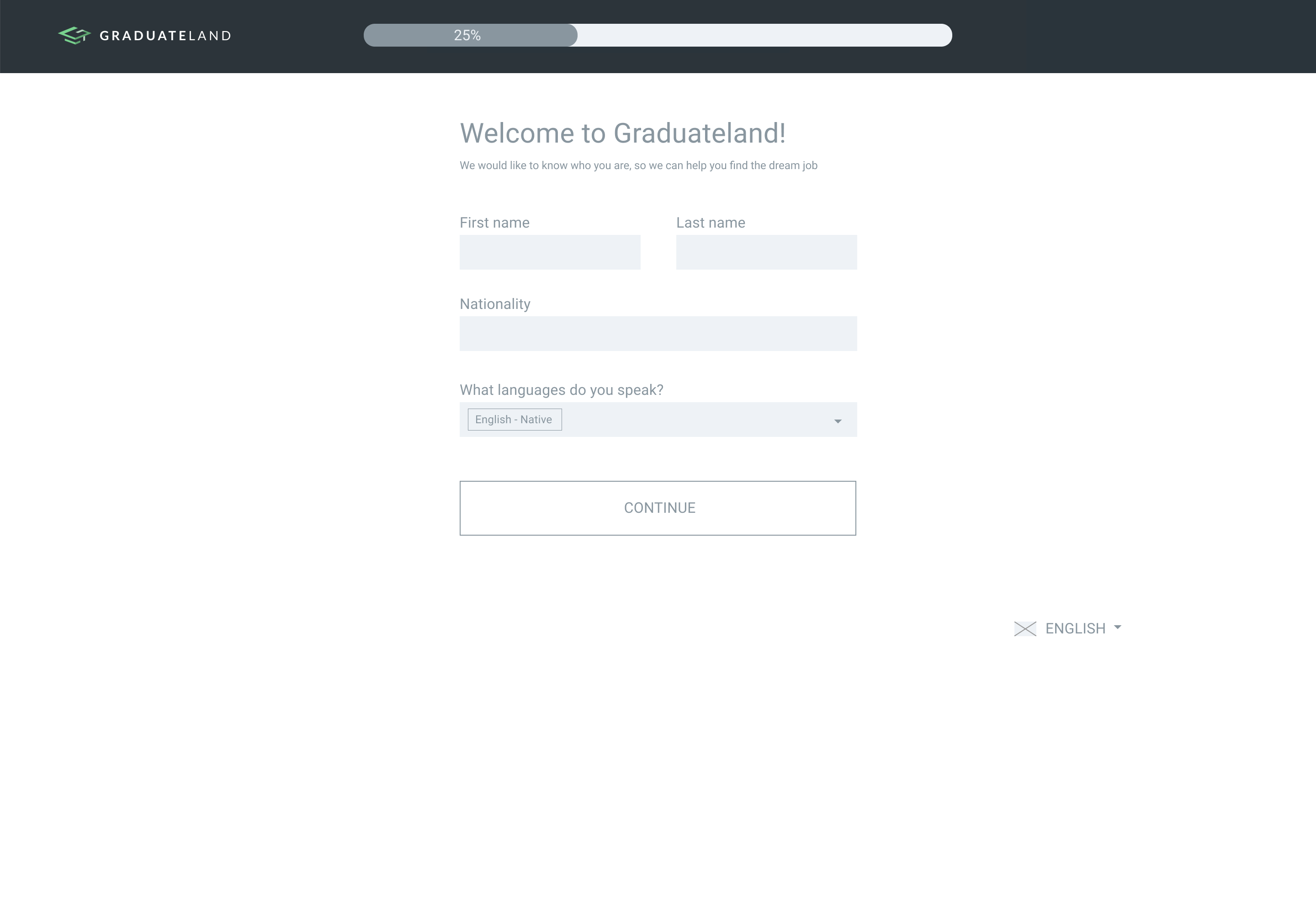
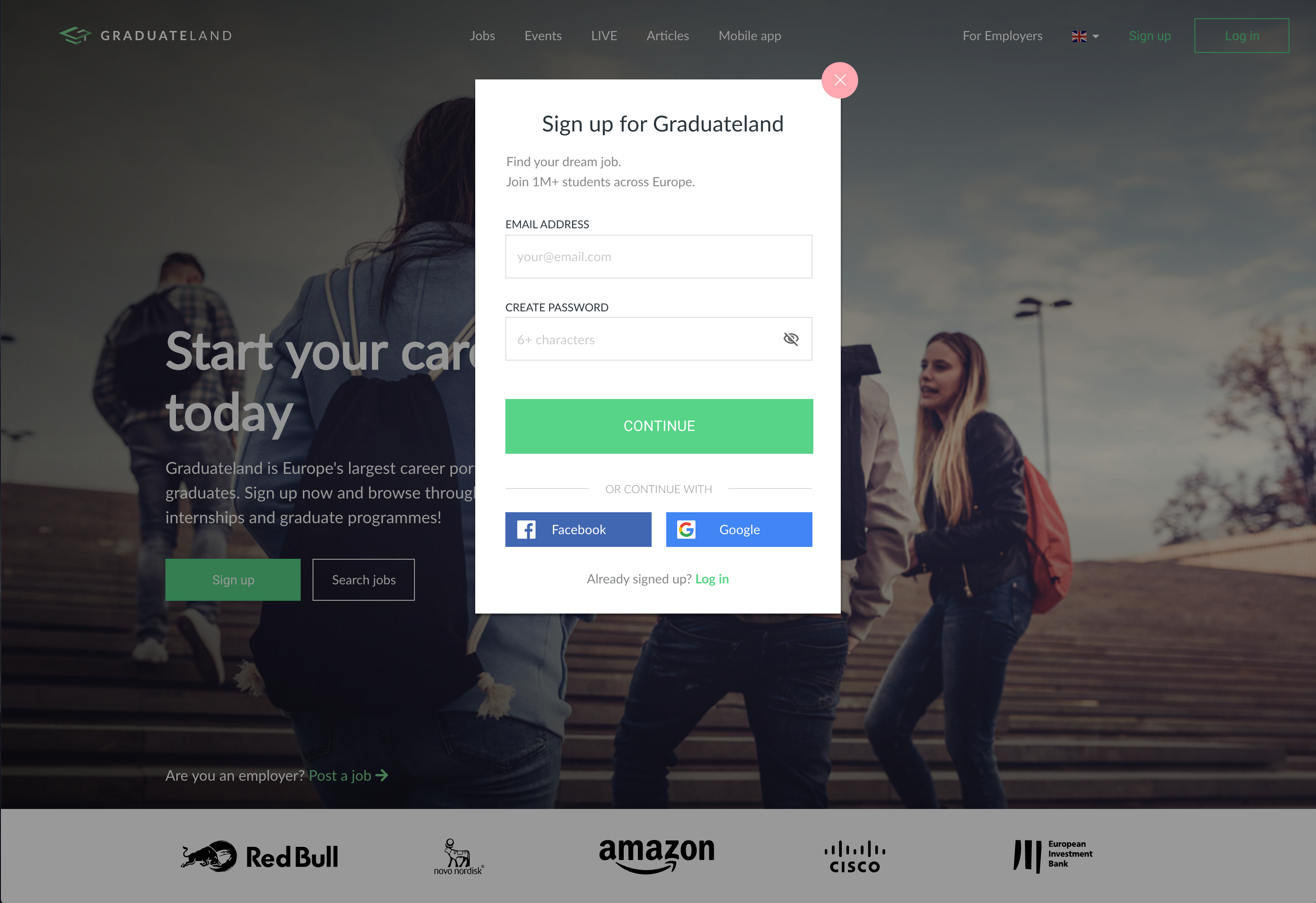
To explore how to improve the signup flow, I reviewed patterns from platforms such as Google, Facebook, and LinkedIn. This highlighted a shift in approach. Instead of collecting extensive information upfront, the flow should focus on quick account creation and defer additional input:
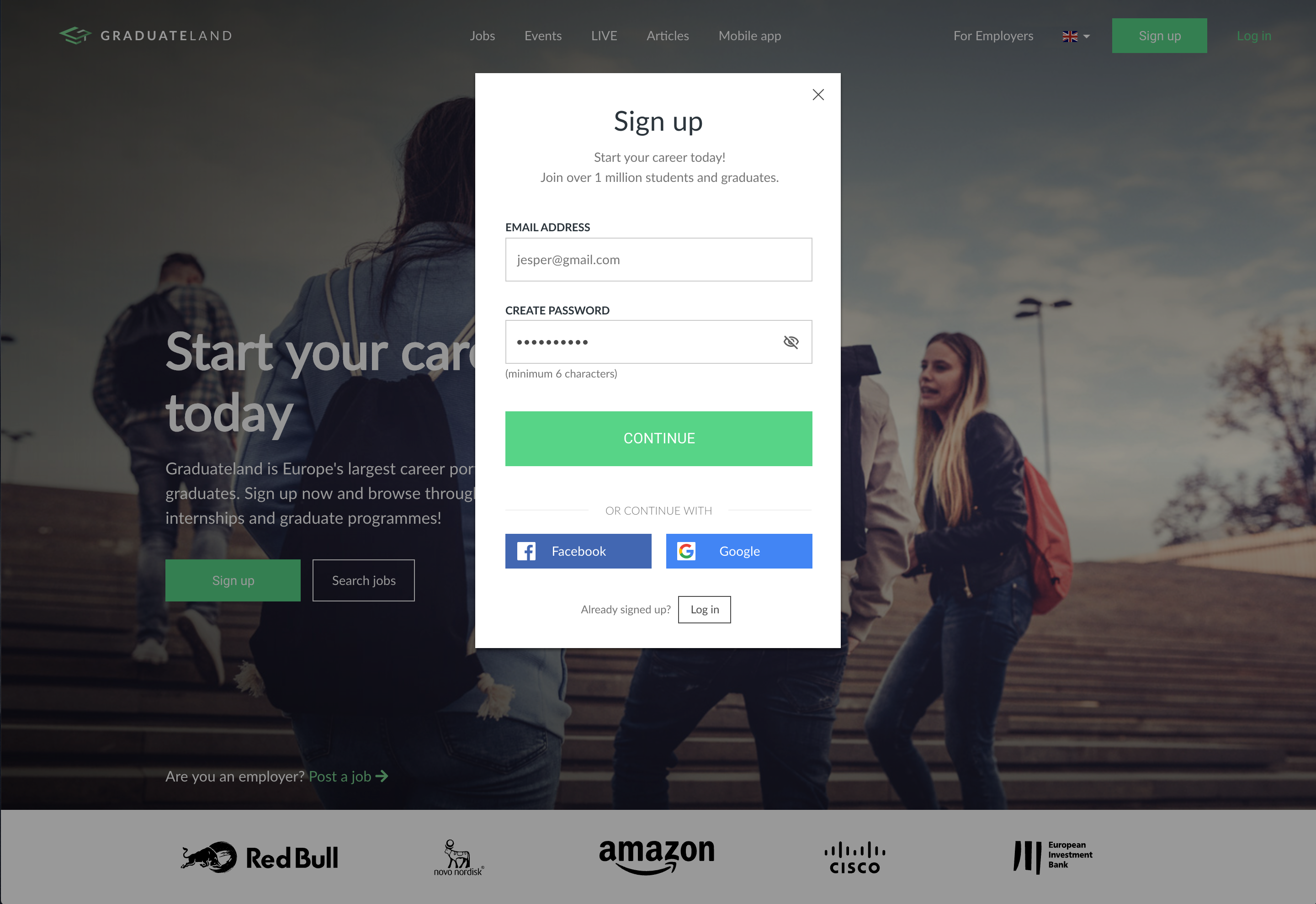
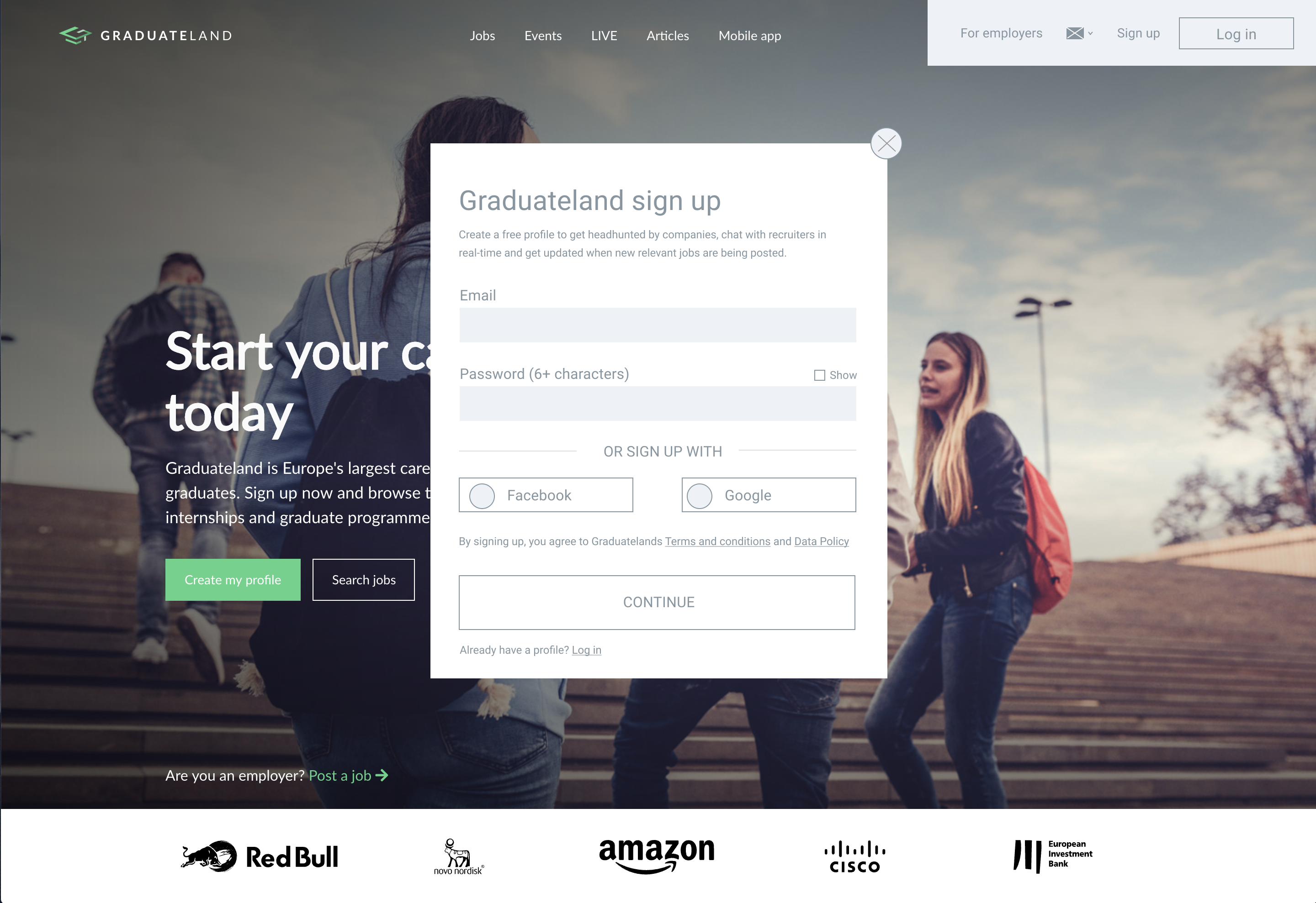
- Start with the minimum required input, such as email and password.
- Remove distractions and avoid links that could lead users away from the flow.
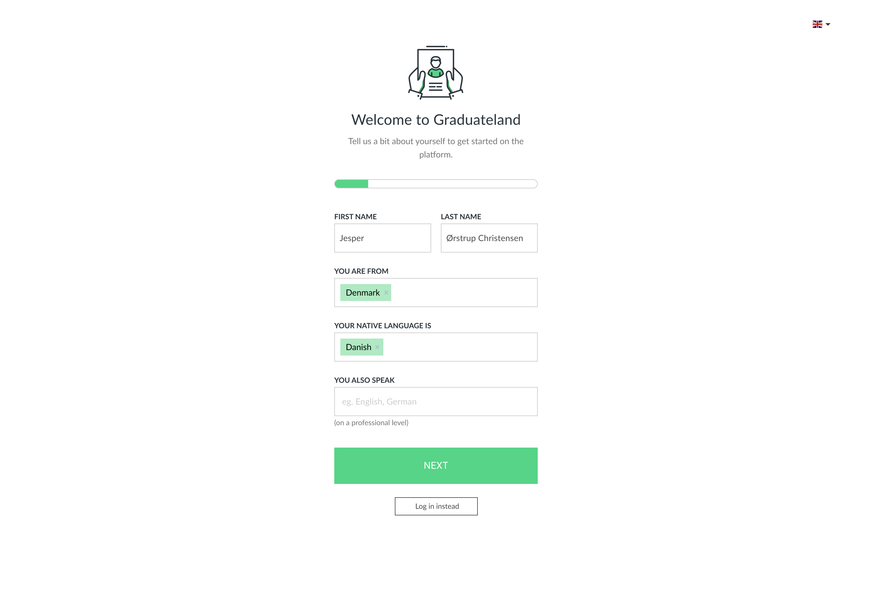
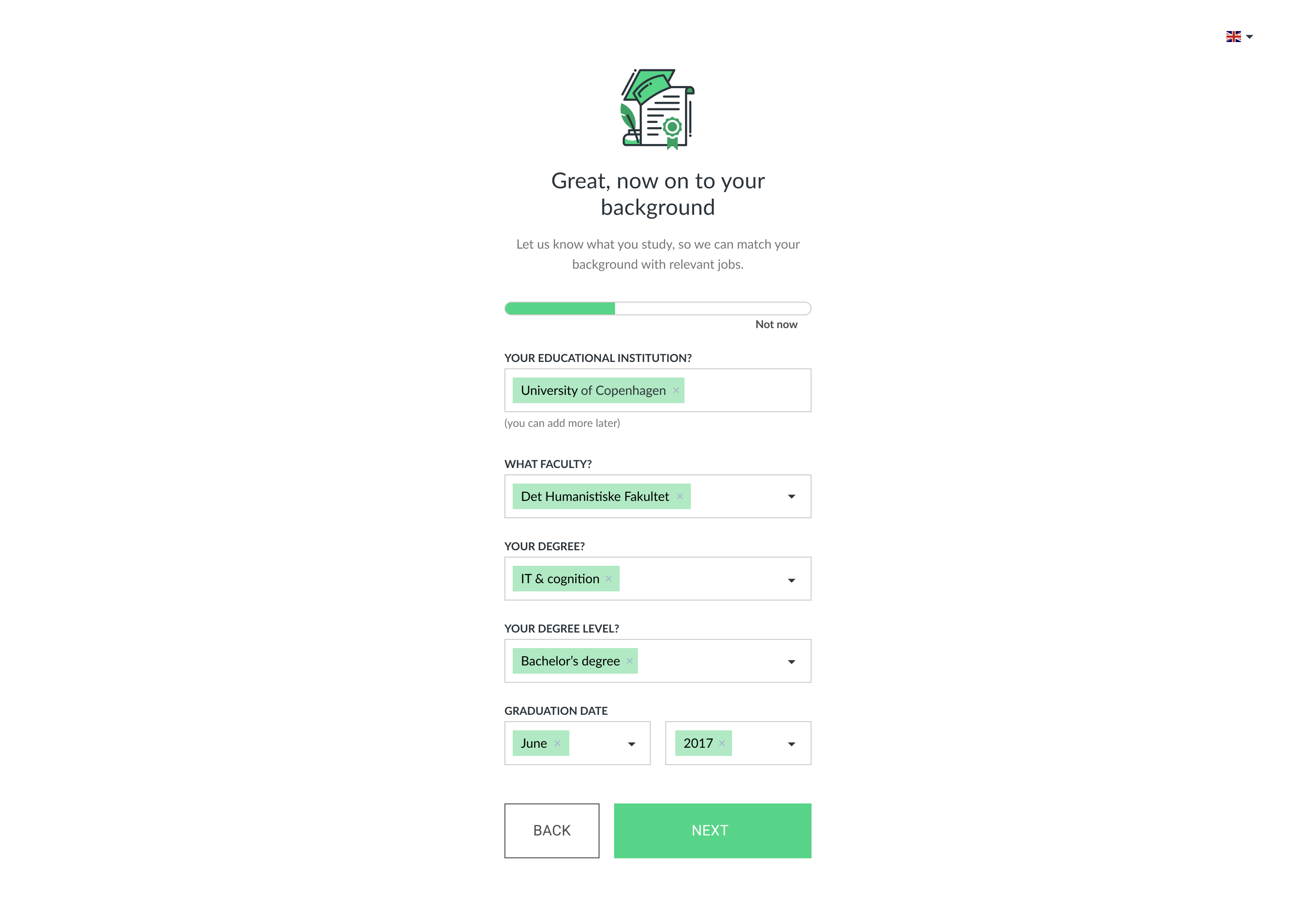
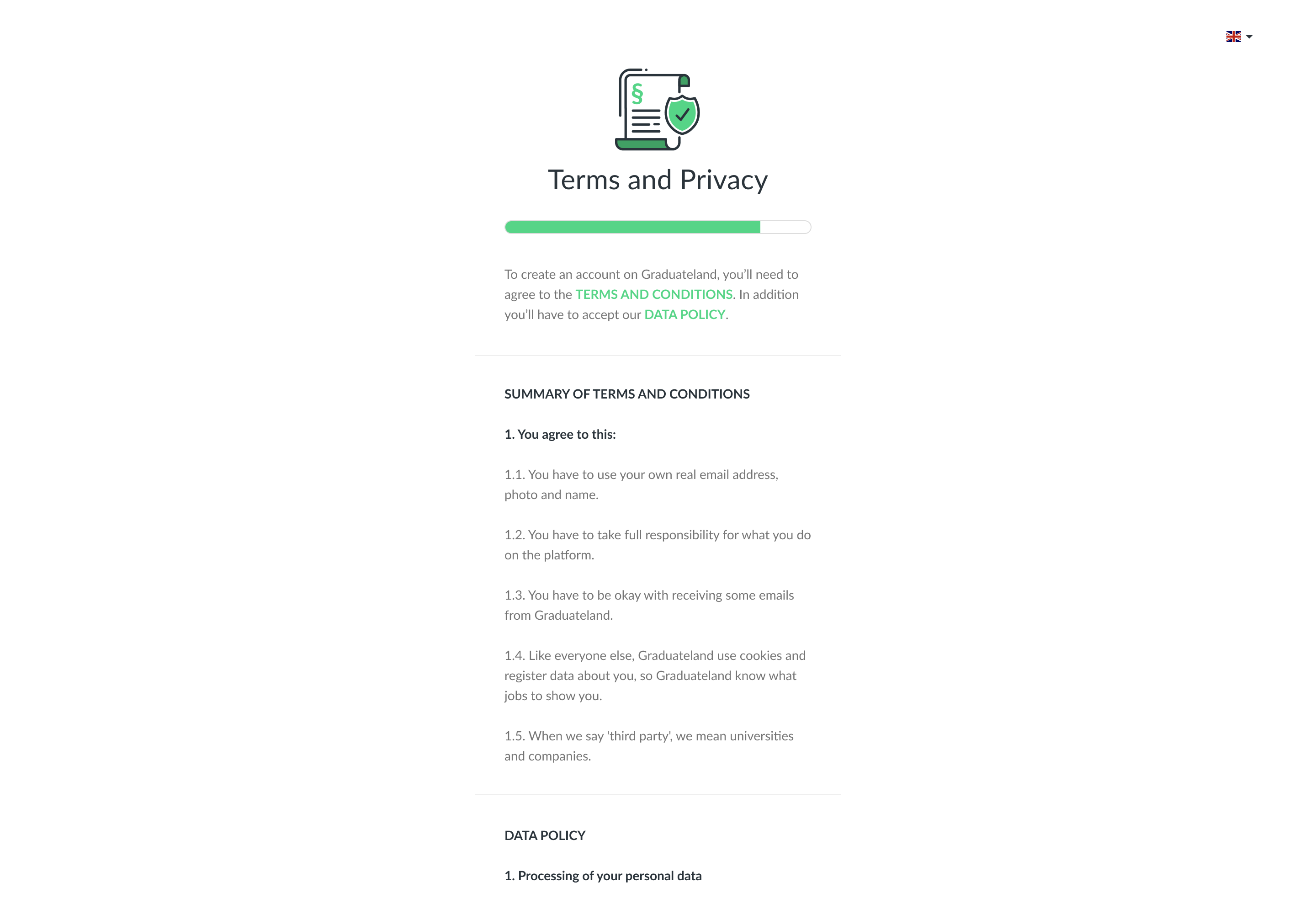
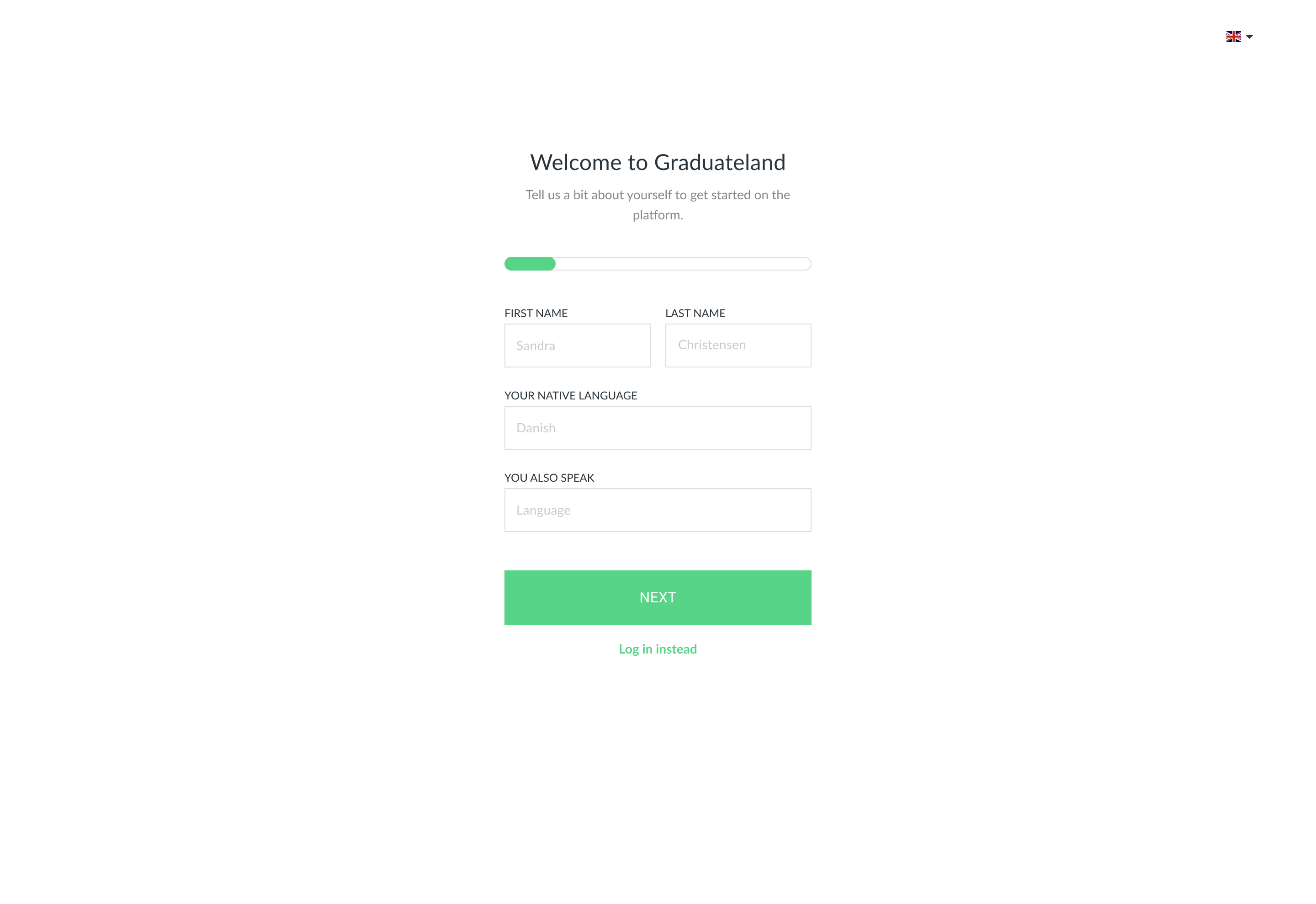
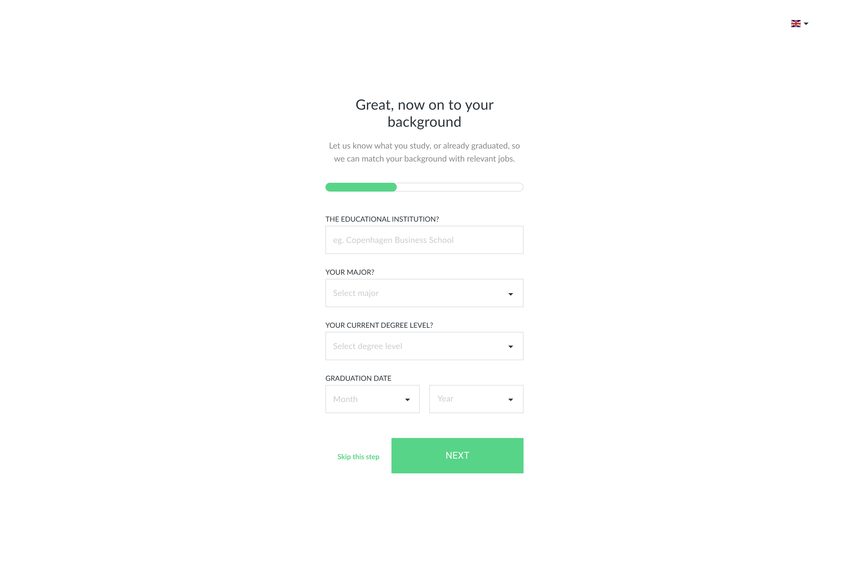
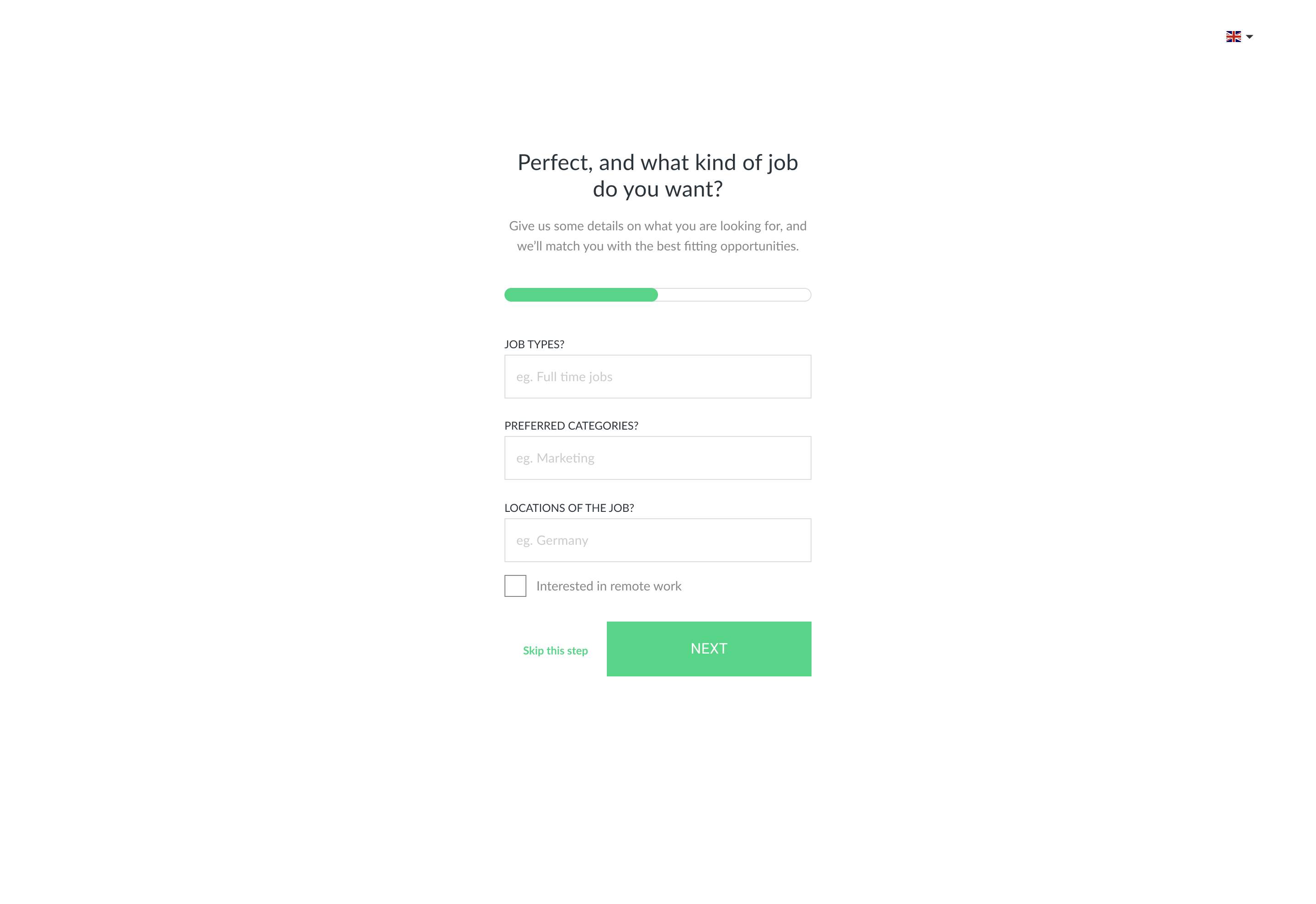
- Use a clear step structure and progress indicators.
- Ensure a mobile-friendly and responsive experience.
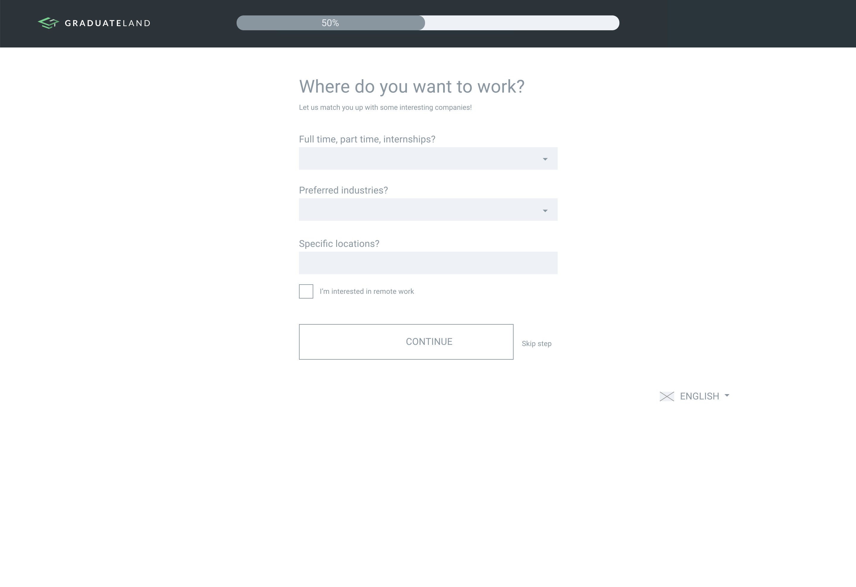
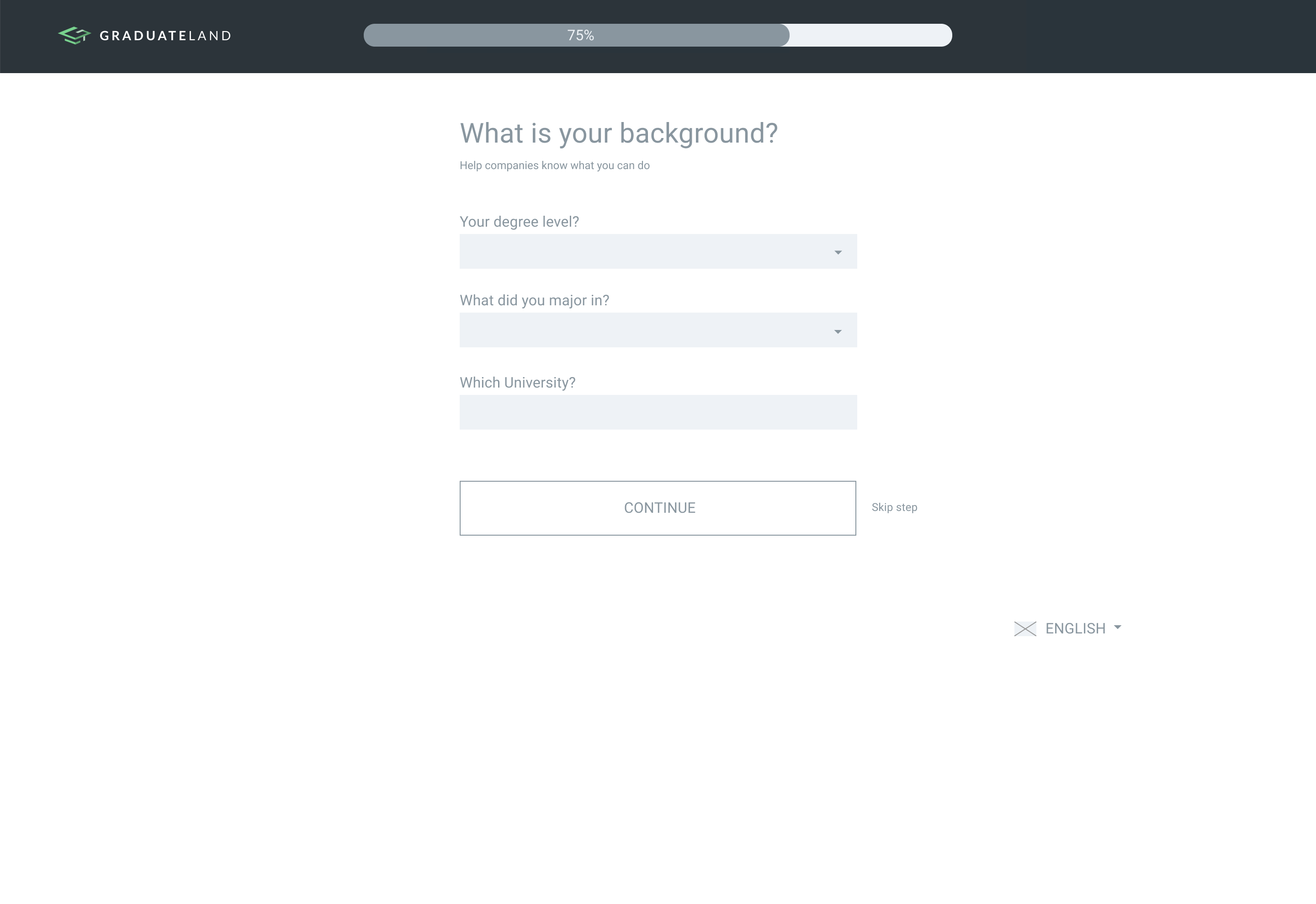
- Allow users to skip or defer non-essential information.
- Use clear, approachable language.
- Be transparent about terms and purpose.
Ideation
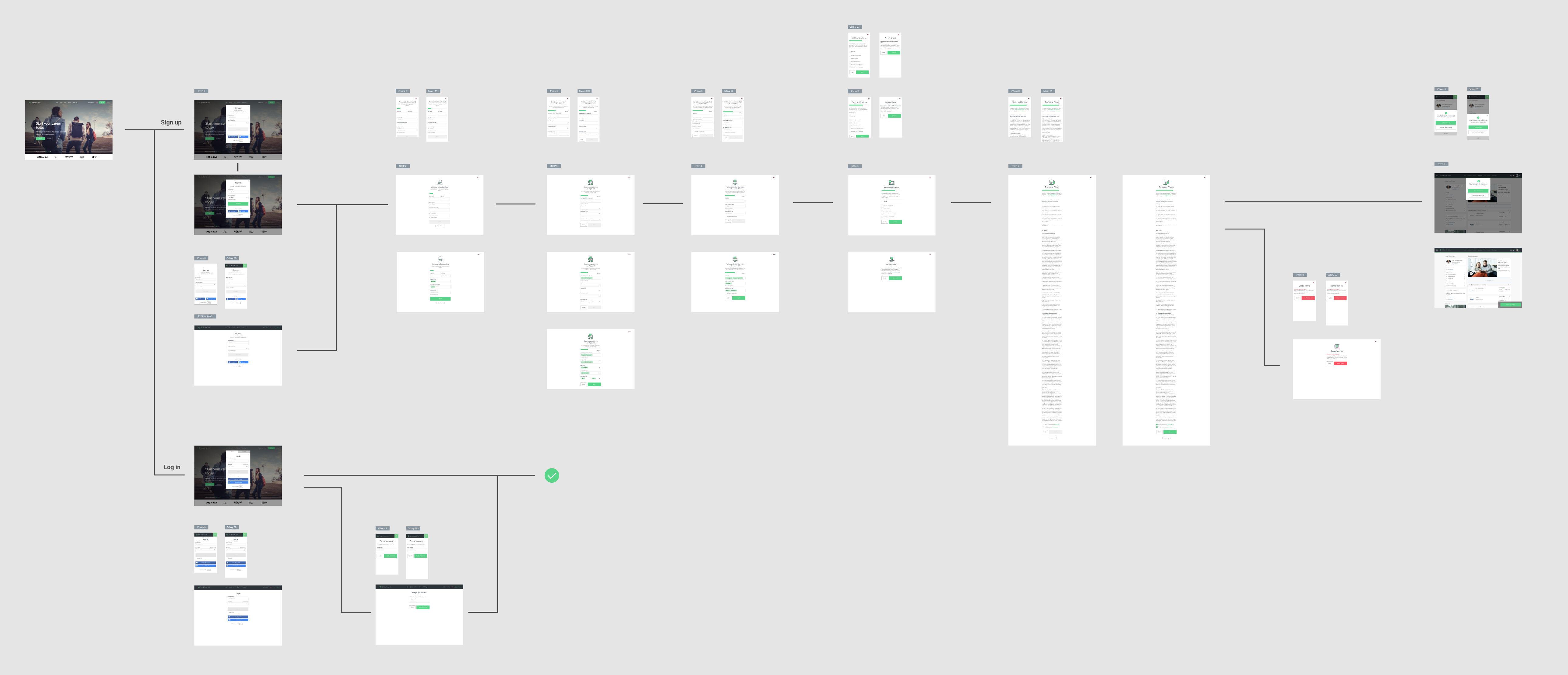
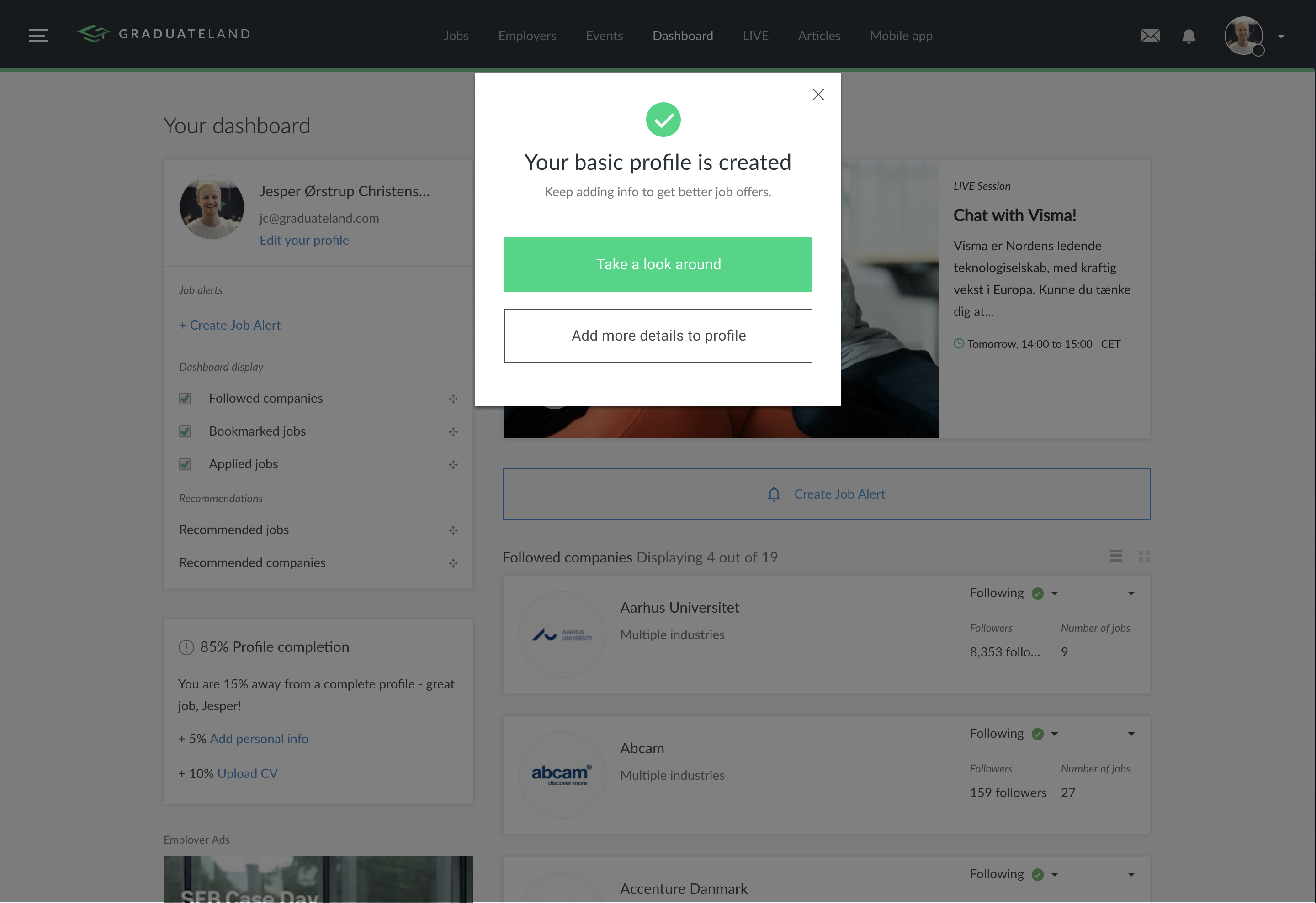
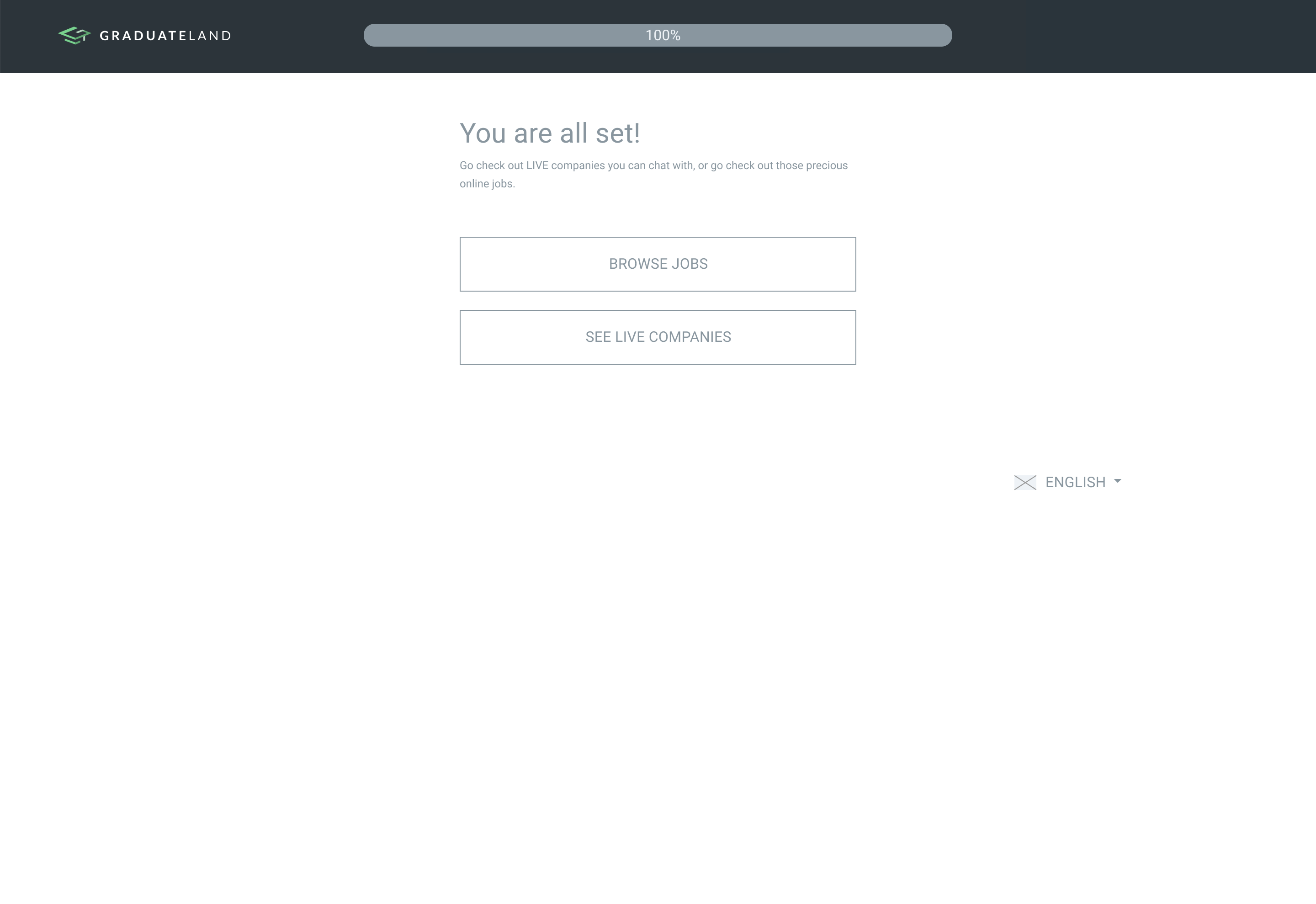
Based on these insights, I explored different approaches to simplifying the signup flow with a focus on reducing friction and keeping the experience aligned with the rest of the product. I developed and iterated on wireframes focused on step-by-step progression, reduced input, and clearer guidance. The designs were reviewed with developers and stakeholders and resulted in a final interactive prototype ready for validation.
User testing
To validate the new signup flow, I conducted guerrilla usability testing at the IT University of Copenhagen, where students were asked to complete the flow and share feedback along the way. The sessions revealed issues with copywriting and clarity, which were refined in the prototype. I then ran remote unmoderated testing with international participants to assess how the flow performed across different contexts. This confirmed that the updated flow met user expectations.
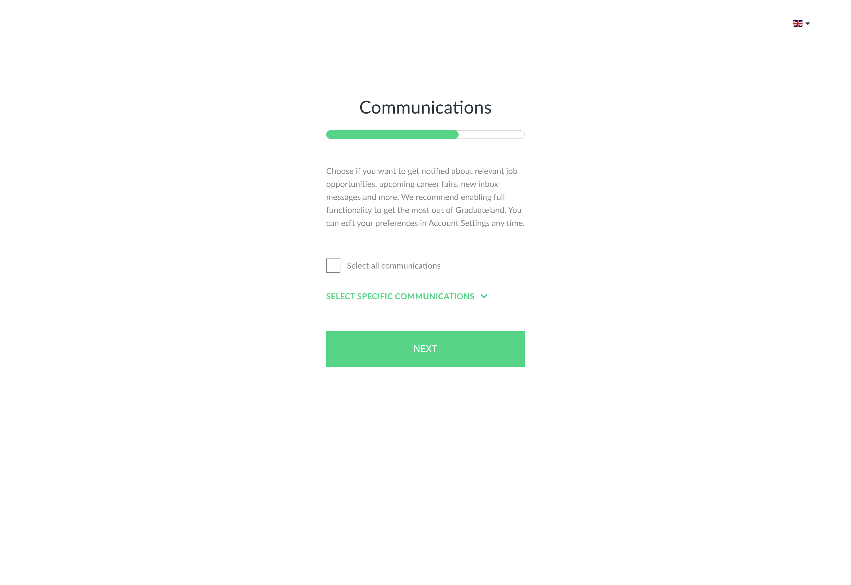
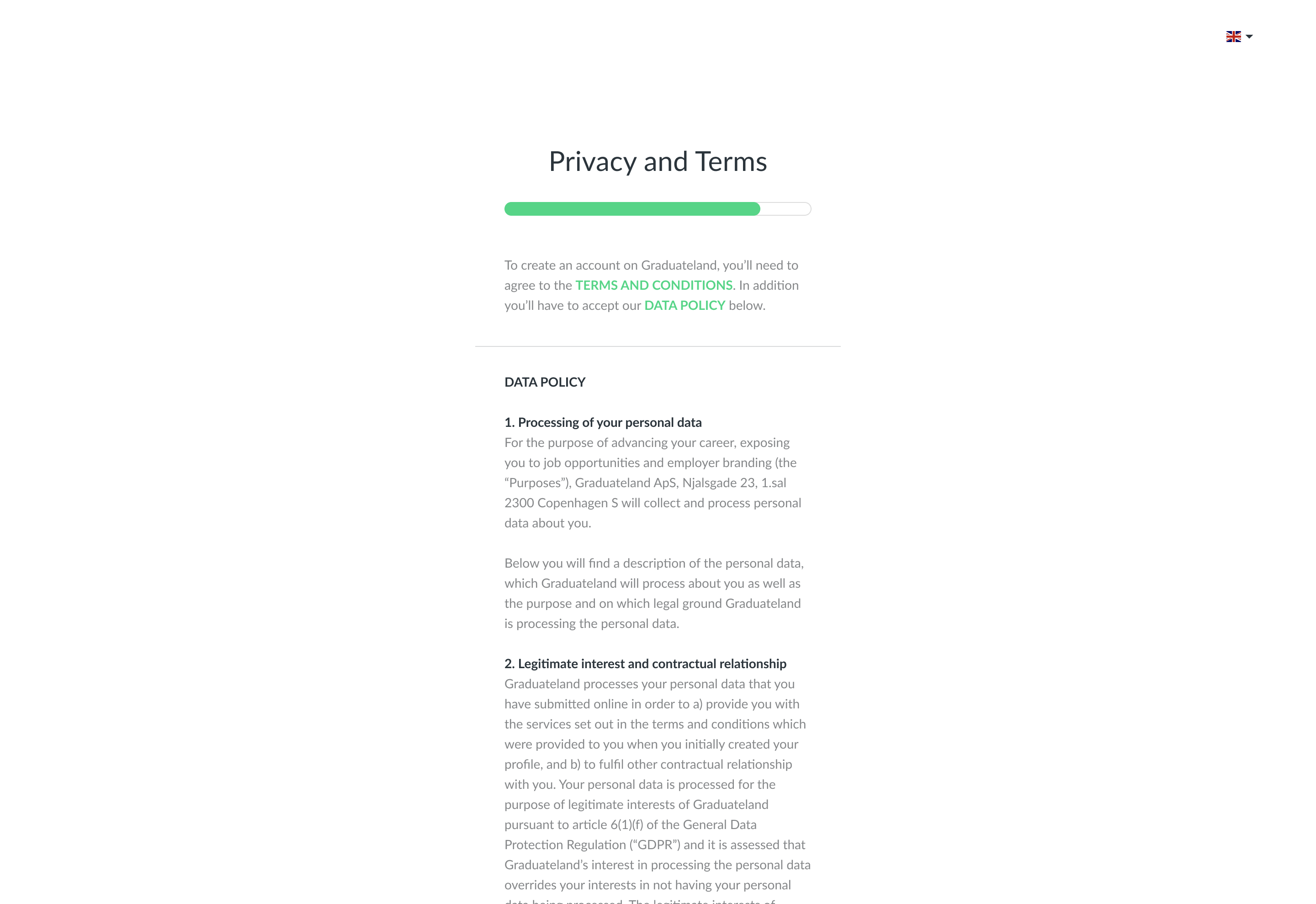
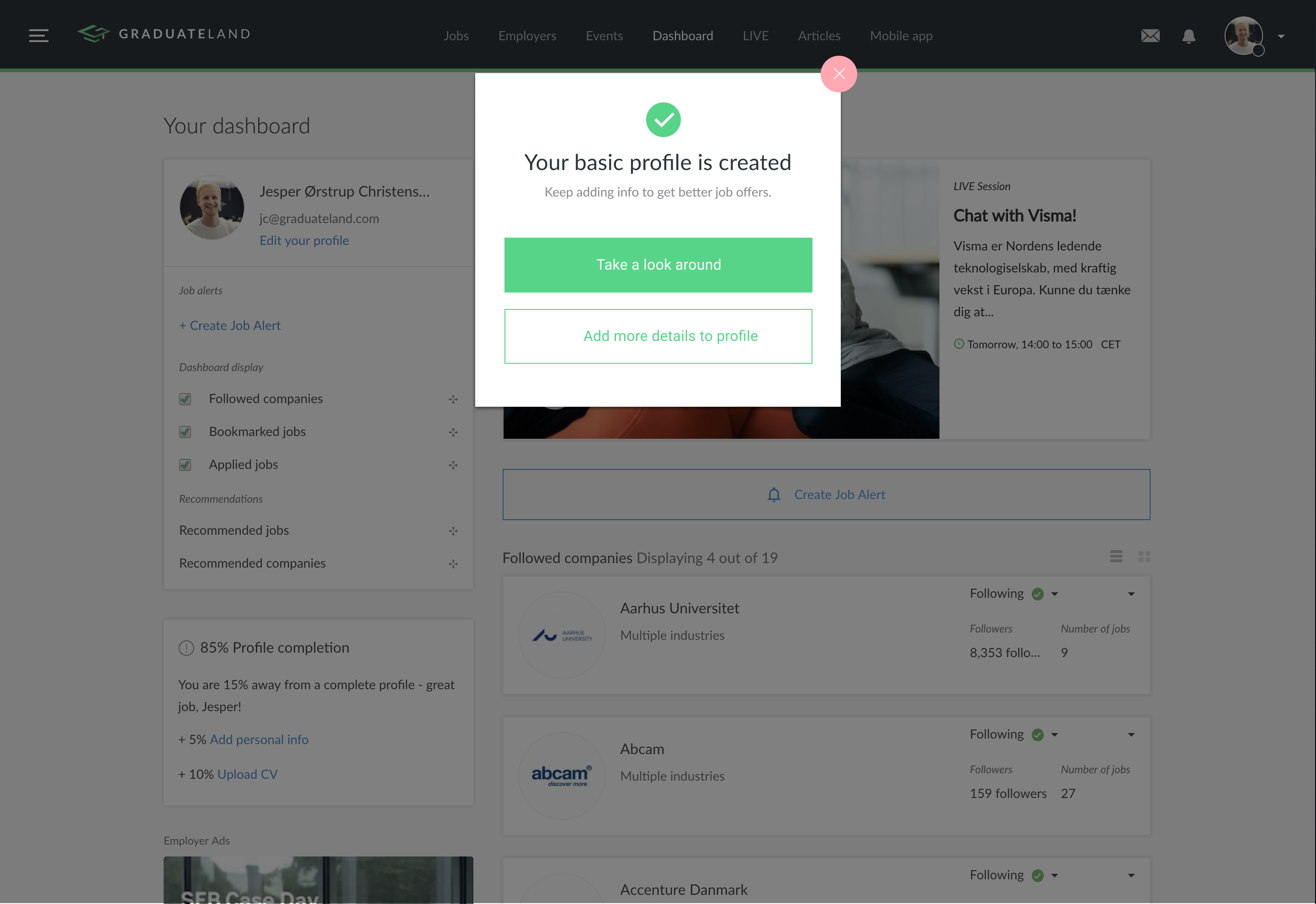
The result
The redesigned signup flow led to a 24% increase in completed signups within the first week. After three months of continued use, the improvement reached 30%. The increase was driven by a simpler flow, reduced input, and clearer guidance throughout the process. The project demonstrated the value of an insights-driven design process and helped establish user testing as part of product development at Graduateland.